May 04, 2005 | Category:
Hi there,
My Blogiversary is coming up in a couple of weeks and to celebrate, I am going to hire someone to overhaul the look/feel of Corporate Mommy. I am desperately seeking suggestions - won't you? Please? Be my neighbor? Er, I mean, give me your ideas?
(Please, no, really, - leave a comment even if you think it should just stay the way it is - as you may tell, I'm not big on changing what isn't broke. Maybe I should spend the money on a spa day instead?)
1. I'm thinking of changing the color scheme. Is black text on white backround the easiest to read? Should the text box be wider? The sidebar easier to read? Less cramped full 'o stuff? What grade do you give the color and layout now?
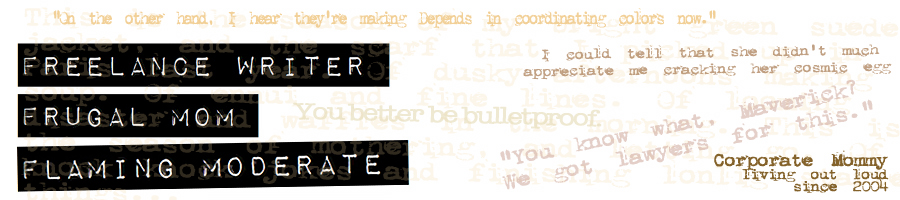
2. Should there be a picture of me? A different banner?
3. How do folks feel about a a midi of "Dream the Impossible Dream" that would play every time you loaded the page? Maybe not? Maybe "Wind Beneath My Wings"? *heeee*
4. What kind of gin can I use in a celebratory appletini if I really don't like vodka?
5. Recommendations for designers? Packages?
6. After all this time, should I bring over the old blogger stuff? Because I got TONS of old blogger stuff.
7. How do you feel about the "100 things" and the "About" - would a list of "Best Posts" do a better job of introducing newbies to Corporate Mommy?
8. Should the Bear Stories have a button all their own?
Thanks! Have I told you lately that I love you?
Share:
 Delicious!
 |
 Stumble It!
 |
 Slashdot It!
Tagged: Corporate, Mommy, Life
I like your basic design as is, though I understand the desire for a new look.
Just a response to your question re: width of text box. A friend of mine who is involved with graphic layout (including books) has a rule of thumb that a column of text should be 70-75 characters wide. Much arrower than that makes the text seems choppy; wider, your eyes don't scan the column easily, leading to eyestrain.
Hmm...I will have to get back to you about overhauling the web site. I kinda like it now. I like the 100 things. Give Bear a button. I like blue and your banner is great. Change a few things just to keep things fresh, but there's no need to go nuts; a day spa sounds great! NO MUSIC. I've been staring at a screen all day and am fresh out of design ideas, but I tell you what...Bombay Sapphire is the best gin for martinis. I think I'll go make myself a martini now, since you mention it. Quite tasty. Great way to unwind at the end of a day of staring at a computer screen!
Hey, just found your blog as I was looking for Dawson's creek pics to ilustrate my blog about this "shame-show"
Looks like we share that ;-)
I hope I am not too late to provide feedback on the blog:
Would love to see a picture of you and please please keep the 100 things, it's one of my favourite reads. Bear surely deserves his own button and otherwise the banner and general look is great, so I would not change a thing (except removing the column with latest comments). Hope you had a fantastic mother's day! Love.
Happy Mother's Day! I never fail to smile when I think of you and your gorgeous way with words. Have a wonderful day!
As long as you end up with a comfortable place to write, and do, in fact, keep writing, I really don't care how the blog looks. It'll be perfect, as long as you like it.
I like the current color scheme. I like the bear story button idea and yes to a picture. Personalizes the site. But I wouldn't change just to change. I've left mine exactly the same since I first designed it.
Yes to a pic, best posts would be nice, but leave everything else that way it is. Now stop obsessing and go to a spa!
Later
I personally like the 100 things, I always read them.
I just employed web-divas also, they are quick and good! I suggest getting Cherry to help you out. I have seen some good pics at getty images of corporate women with kids at their feet.
I used www.web-divas.com to do my blog, they are great. You should give them a try.
I'm going to have to vote yes on the picture, a big 'ole NO on the midi and leave the rest the way it is. Oh, and no suggestions on the alcohol, unless it is a microbrew - I can't help you.
Okay, now I feel incredibly guilty for not finishing the design I started those months ago. Augh! The guilt! It hurts!
Black on white definitely easiest to read -- keep it. Keep the rest. Add a picture of yourself somewhere. Now go to a spa day!!!
1. White on black is definitely the best. Easy to read, classic and classy all at the same time. You can go with a very lightly shaded background but nothing more than that. Kathleen's background is the darkest I'd ever go.
2. A picture? Absotively. Bet you can't beat my cow pic though. Heh. I think your banner is kick-ass right now. I wouldn't change it except for colors if you go with a different color scheme.
3. No.Midi.Ever.
4. Gin glows under blacklight. Substitute a decent single malt instead.
5. Um. No idea. Rob has been the only one to ever stroll through my templates. You might be able to get some help here with a post at Munuviana.
6. Yes! And we'll even be able to do this soon.
7. 100 things is too long. Lists of facts, even when presented with humor, just don't hold my attention. Now those same facts wrapped up inside of juicy anecdotes are a fine repast. Go for the "Best of" option.
8. Yeah. Give Bear his own category. With MT you can assign more than one category to a post so one post could be a "best of" as well as a "Bear".
I love this look! The banner is great. It's always nice to have a picture to put a face with the name. And I like the idea of a Best Posts, it's nice to learn the history if you're new. Have fun!
I really love your site - I can't think of anything changes specifically. In terms of #3 - I vote no on the music.
'100 things' lists are okay as introductions, but I rarely make it through all 100 when people do that.
Happy blogoversary and thanks for writing!
1) Just an FYI, but people with vision problems can usually only read black text on light background. So FYI.
2) Yes. Cause we're nosy.
3) It may cause me to commit random acts of violence, but at this stage of my life, that's probably ok.
4)Bombay Sapphire. You'll never think about Tanqueary again.
5) Calvin Klein. Or Prada if you're feeling really naff.
6) Technical web question. I think I just blew a fuse.
7) Sure. I never read stuff like that, but sure. Then again, I'm not a newbie. Well, not at blogging anyway. Numchucks and I still haven't gotten acquainted.
8) To quote the fabulous Steve Martin: Set your heart free and your mind will follow.
I love it the way it is and wouldn't change a thing.
I think it's great the way it is! Sometimes change is good, though. You could always just buy a new skin. I personally like bright colors and big, bold graphics, but nothing that's too busy or hard to read. After I've gone to a site a few times, though, I don't really pay attention to the layout. I guess I just get used to it, and my brain filters it out. Huh.
I'd stay away from music. If people are surfing your site at work or in the presence of sleeping children, that could get them in trouble. :-)
hmmm. First I would get rid of the most recent comments thing on the sidebar - seems a bit cramped. While we're talkin about the sidebar maybe remove the AOL instant messenger thing since I don't think I've ever seen you actually online on that thing.
I like the about page and the 100 things. When I first found your site I read those first to get a feel for who you were. It helped and made me read on.
Who am I to judge these things though. I simply have the template that looked the least offensive at blogspot.
Happy early blogoversary.